The Seelpy layout introduces a new concept in keyboard layouts, unlike anything else yet on the market (AFAIK). It is unconventional and will probably meet with a lot of criticism, particularly regarding the learning curve. I have not yet tested the layout myself, so that discussion may be a bit academic right now.
However there is no denying the sterling scores that the layout achieves, particularly in English (or even Latin or local African languages, for that matter.)
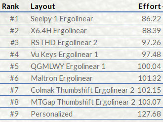
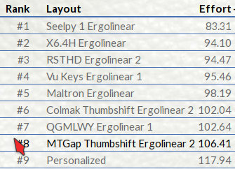
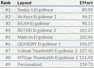
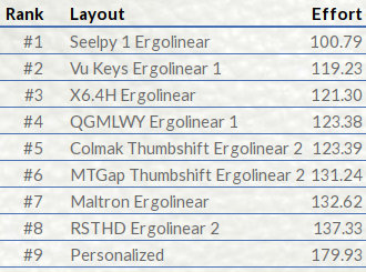
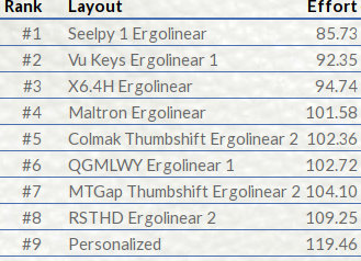
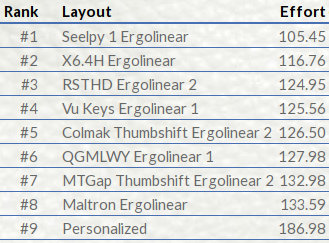
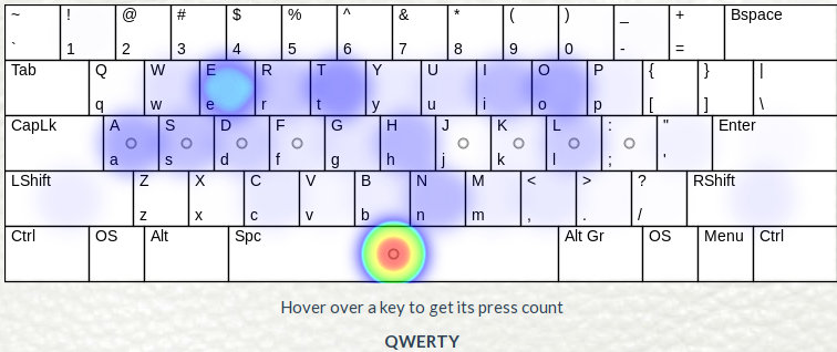
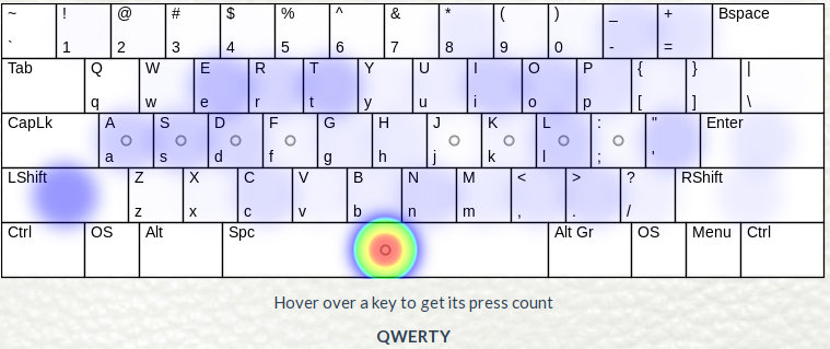
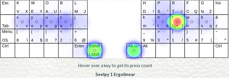
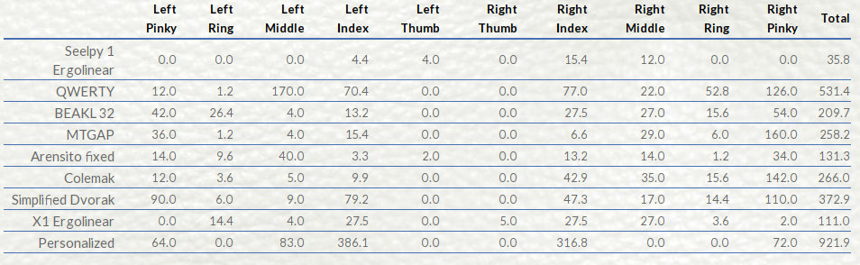
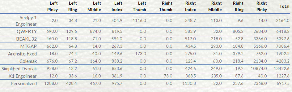
Here are some test scores, competing against other top layouts, all on the same form factor, for the three standard tests on KLA, as well as Pangrams, Latin (Magna Carta) and Keyboard Layout Editor (HTML/CSS/JavaScript/Angular).
In the scores below, the previous best layout overall was X6.4H, but ignore that and look at the gap between Seelpy 1 and the next best. That should put things in perspective.
| Alice | Common words | SAT words |
|---|---|---|
 |  |  |
| Pangrams | Magna Carta Latin | Keyboard Layout Editor |
 |  |  |
So before we get to the layout itself, here's the bad news, or what people are likely to complain about...
| Issue | Response |
|---|---|
| It's different from QWERTY | QWERTY is terrible. Any improvement is better. |
| It's too different from QWERTY | Yes it is. You use about half as much effort to type, compared to QWERTY. |
| It's impossible to learn. | Maybe. Jury is still out on this. I will build one to test. |
| Ctrl-X/C/V is broken. | Yes, like MTGap or Dvorak or Vu Keys or Maltron or Arensito, all of which are way better than QWERTY. There are workarounds.
The traditional shortcuts are still doable, even on the left hand, you just need to add Shift (left thumb) to the combo. On the positive side, this helps prevent accidents. The Ctrl-v is more problematic, I suggest mapping Ctrl-y to Paste instead, then the hand actions are the same for all three. Ctrl s/n/t/z are now on the right hand in easy access. Ctrl-p and r are problematic, as is Ctrl-b. Ctrl-a and i are okay on the left hand. |
In our (my and Den) testing of various layouts, we started to pay attention to Arensito, which looks like this:
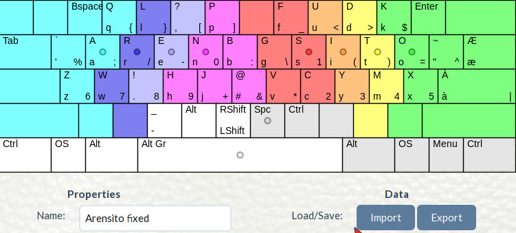
Arensito's key innovation was putting the digits and punctuation on the AltGr level. People with European keyboards are already familiar with that concept, but it is normally used for the high-ASCII characters like é, ñ, ç, ø etc. So putting the digits and regular punctuation on that level was a breakthrough.
Then Schizo came along with his three layouts, which are variations of this:
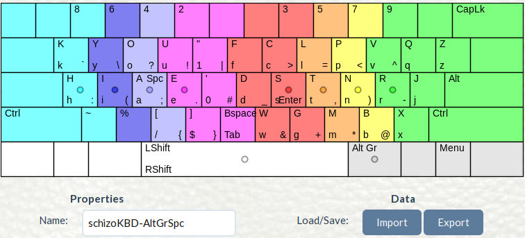
Note where Schizo puts Space and Enter ... on the AltGr level.
These ideas led to our own AltGr layouts on ANSI, then Ergo, including trying letters on the thumb keys, then finally to the new form factor, Ergolinear, which looks like this, with the X6.4H, previous best layout:
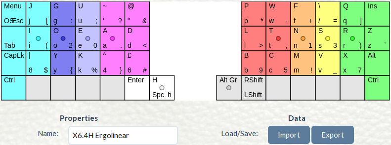
The 'unique' thing about this layout is that the h/H is on the space key. Even worse, h is on the AltGr level, but despite this (or because of it) it still gets the best scores.
The little voice inside my head was telling me to stare at that space/h/H key, because it holds the secret to the next major improvement... but I couldn't see it....
Then the other day, which reading recent posts on Den's blog, I got to thinking about if lower case and upper case had the same frequency. Turns out they don't. A bit of research led me to a case-sensitive frequency
list:
e t a o i n s r h l d c u m p f g . y w b - , v 0 k 1 T A I S 2 C ' " / 3 E D 9 : M N = R P ; 4 O B 5 ) L ( H F x 8 W 6 7 G _ U j q z J < ? Y @ * V K ! | $ ~ [ ] % X & + # Q Z } { > ` \ ^
which led to this:
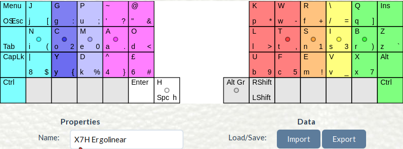
But the difference in scores between that and the X6.4H was generally ± 0.5, nothing to get excited about.
And then I had an idea... a rather radical one. What if we split the cases completely? Most of what we type is lower case, so why not put all those on the home row?....
In truth, the secret of the space/H/h key is this: H is not "shift-space". H has nothing to do with Space. This concept can be extended...
The plan was rapidly taking shape.... a three-row setup, with Caps on top row, lower case on home row, and digits and punctuation on bottom row.
Since we have 10x3 slots on each row (or 11x3), and only 26 letters, we could put the most used puncutation on home row as well, and another four on top row.
Already the name was forming in my head... three rows... Capital letters, Lower case, Punctuation .... C-L-P ... Seelpy. I picked S instead of C because
I didn't want people saying Keelpy. Besides, it looks like Sleepy, and people will do a double-take and wonder if that's what I meant....
And so here is Seelpy 1.
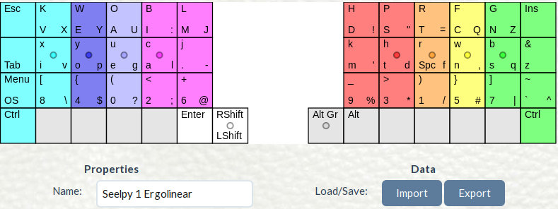
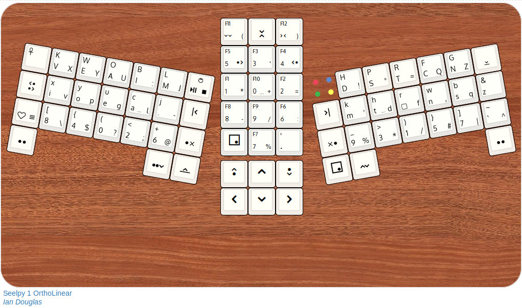
As per usual, this schematic only shows the keys that KLA worries about, a full keyboard will have additional keys, left as an exercise for the reader. A possible implementation looks like this:
I also have two variants, but both of them have problems... you could switch the space to the right index, which produces better scores, but then the right finger flies around a lot.
The other variant puts Space on Shift-AltGr, but I'm not even sure if that's allowed, and it also destroys the chance of putting anything else on the keys that requires shift-altgr-key. That variant actually gets
the best scores overall.
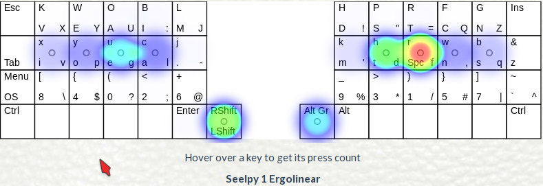
For Keyboard Layout Editor:
 |
Xax International Copyright © 2024. All rights reserved. |