We start at Keyboard Layout Editor (KLE) of course. I initially set out to design an optimal layout for programmers, which was rather ambitious. The problem is that different programming environments have different needs. People using EMACS have different needs to people using Vim, who have different needs to people using a full-blown GUI for coding. So one-size-fits-all will not work.
But I didn't know that when I started....
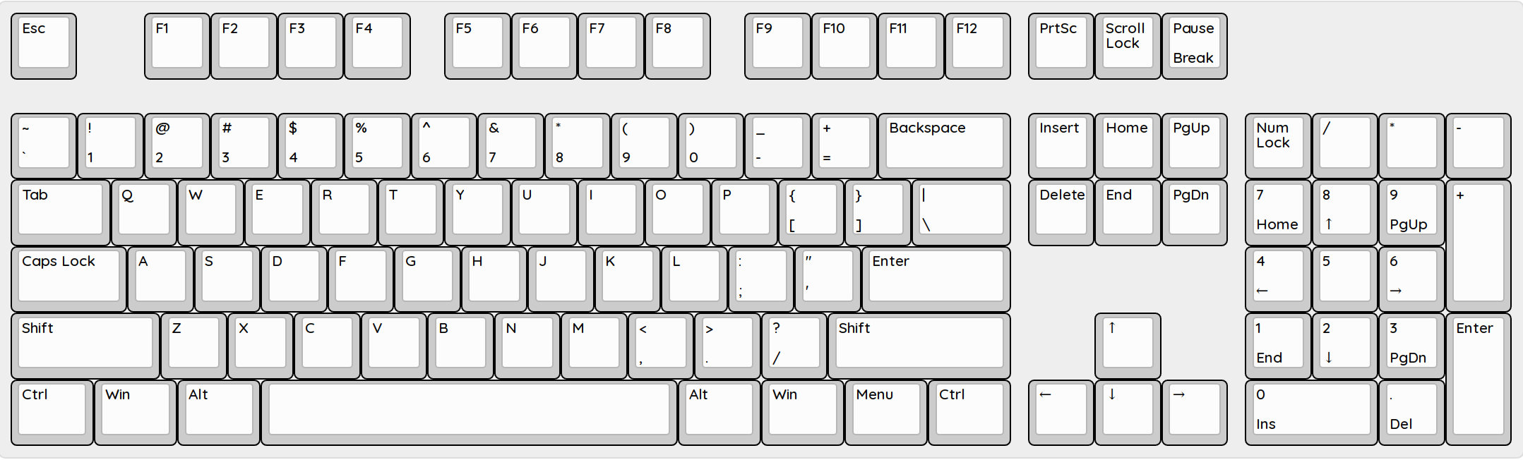
What I ended up with, after a long process which is detailed on my blog, is the Programmers Keyboard which is currently a pre-defined template in KLE.
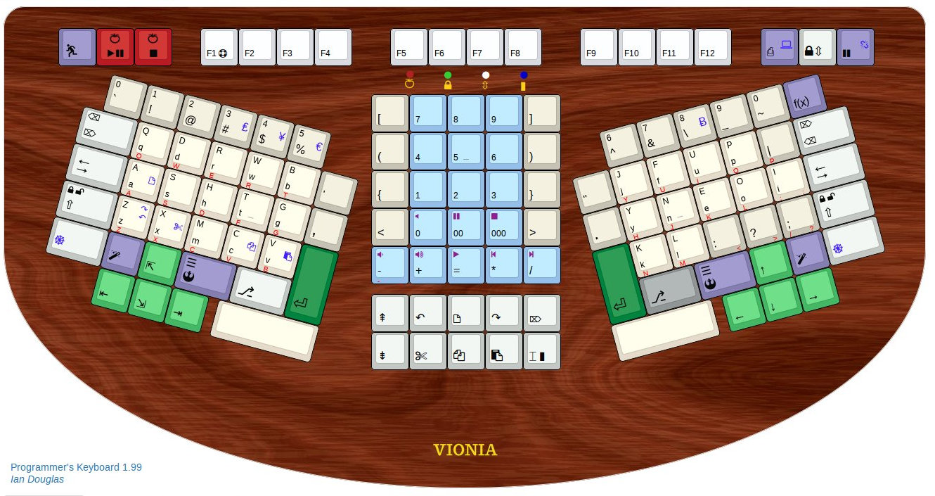
Programmers Keyboard initial release
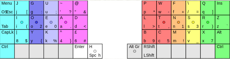
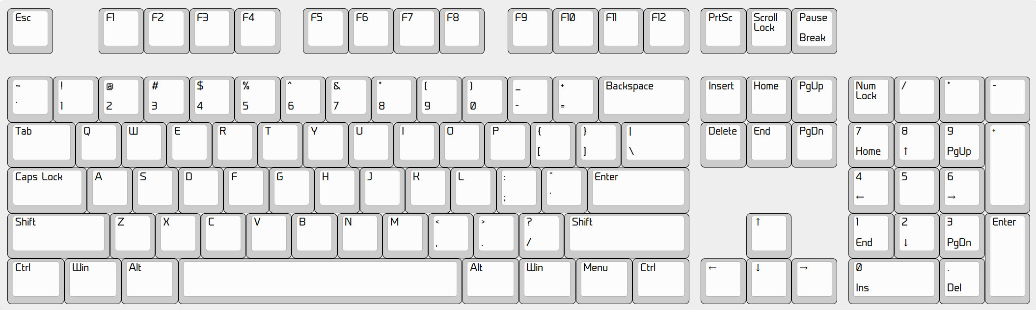
I then developed it further and added bells and whistles, ending up with V2 which is what I thought I would build.
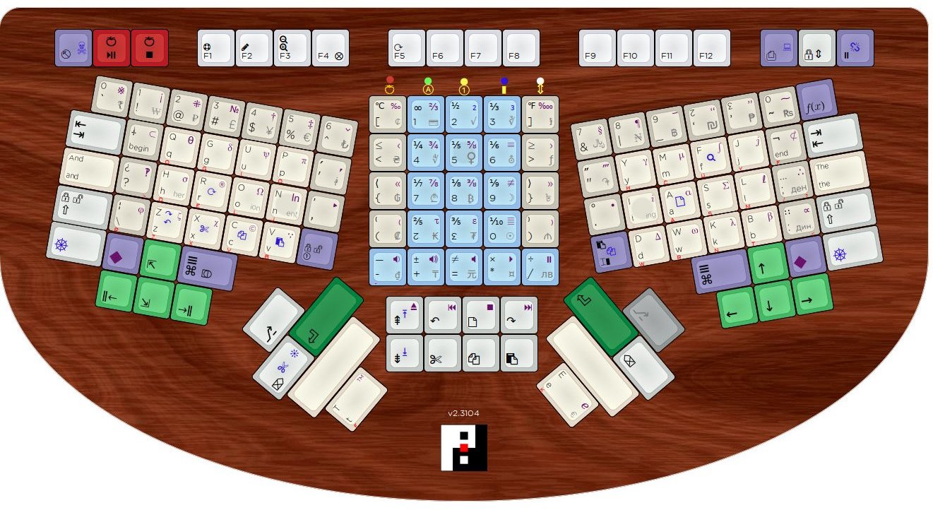
Programmers Keyboard final release
The Alpha key layout is a slightly modified version of Workman-P, meant to be programmer-friendly. I did what I thought was clever, and put the brackets down the middle, had all sorts of possibly-useful currency, Greek and punctuation symbols, one-touch copy/paste/cut/undo/redo/select-all, provision for dozenal/duodecimal support, Pomodoro timer, dual Nav clusters (idea being that lefties could swap them around), and a cool wooden case. In that respect I was aiming for something like what keyboard.io is doing.
And then Xah Lee came along to my blog and suggested, amongst other things, that maybe Workman wasn't the best layout....
Since Xah knows much more than me, that took me to the next phase of this voyage... looking for the best layout for English and programming. I restarted what I had been doing previously (searching for best layout, which led to Workman-P), and found various people had tackled the problem in a more scientific way. I eventually ended up at Patrick's Keyboard Layout Analyzer (KLA), where I spent many hours testing and improving layouts.
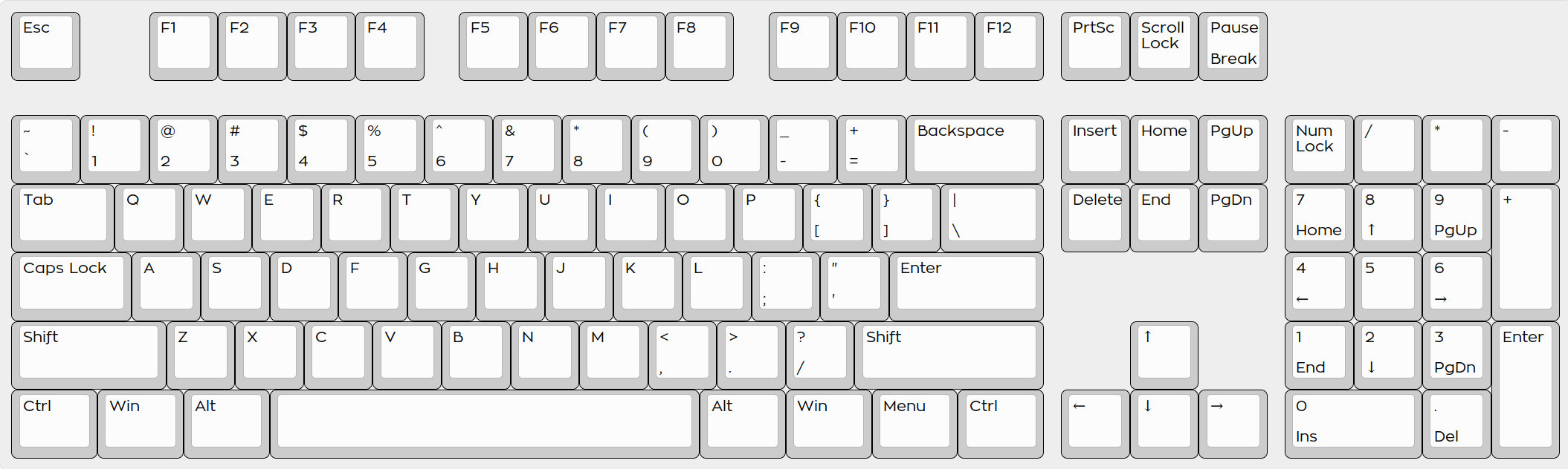
Somewhere along the way I met Den and we started trading notes on layouts. This lead via Arensito and ideas from Schizo to the ErgoLinear layout form factor, shown below, which produced the best scores in KLA. We had to modify KLA to accommodate this. In fact there are now three variants of this (one from me and two from Den).
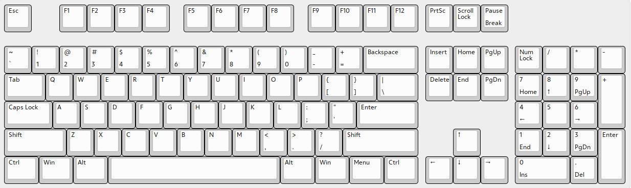
| ANSI 104, QWERTY | 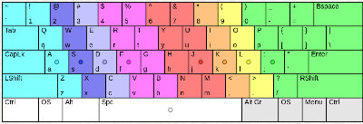 |
|---|---|
| ErgoDox, MTGAP Thumbshift | 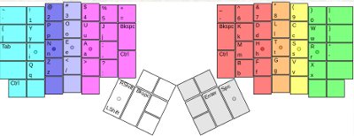 |
| ErgoLinear, X6 | 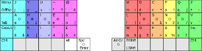 |
There are several unusual things about this layout:
These are the scores as per Den's scoring on KLE. Den's scoring differs from the original in that vertical distance is also counted, as opposed to only horizontal. So it's more accurate. These scores are from the tests I used to compare layouts. Apart from the very technical digit and dates tests, this layout is far above others. Note: lower score is better, we are measuring Effort.
| Rank | Layout | Style | All | English | Prog | OtherTech |
|---|---|---|---|---|---|---|
| 1 | X6.4H Ergolinear | Ergo | 116.2 | 91.1 | 113.4 | 148 |
| 2 | X6 Ergolinear | Ergo | 117 | 98 | 113.7 | 141.5 |
| 3 | BEAKL 4 Mod Ian AltGr 3 | ANSI | 123.7 | 100.5 | 118.3 | 156.8 |
| 4 | MTGap TS ErgoLinear 2 | Ergo | 124.8 | 104.2 | 122.1 | 151.2 |
| 5 | Maltron Ergolinear | Ergo | 126.3 | 98.4 | 129 | 160.3 |
| 6 | RSTHD ErgoLinear 2 | Ergo | 126.4 | 97.2 | 124.8 | 162.9 |
| 7 | Colemak TS ErgoLinear 2 | Ergo | 126.7 | 101.3 | 119.5 | 160.1 |
| 8 | Arensito Ergolinear | Ergo | 127.7 | 110.8 | 119 | 151.1 |
| 9 | Nawfal Ergolinear | Ergo | 129.5 | 109.4 | 121.4 | 156.6 |
| 10 | Dvorak Ergolinear | Ergo | 130.6 | 111 | 128.4 | 155.5 |
| 11 | BEAKL5 ErgoLinear | Ergo | 131.4 | 109.1 | 126.4 | 160.4 |
| 12 | schizoKBD-shifted | ANSI | 133.9 | 101.4 | 120.8 | 181.8 |
| 13 | Plum Ergolinear | Ergo | 137.1 | 118.4 | 131.9 | 161.8 |
| 14 | Arensito | ANSI | 137.4 | 117.2 | 127.1 | 167.7 |
| 15 | Arensito Kinesis | Ergo | 139.7 | 111.3 | 132.3 | 177.1 |
| 16 | Ergodox MTGAP Thumbshift | Ergo | 159.2 | 105.1 | 141.4 | 231.2 |
| 17 | Ian M3 | ANSI | 159.8 | 101.6 | 140.5 | 244.2 |
| 18 | -+T+- HT02a | Ergo | 162.5 | 91.8 | 137.2 | 257.2 |
| 19 | Ergodox Colemak Thumbshift | Ergo | 163.4 | 104.1 | 141.1 | 243.3 |
| 20 | Ian R2 p | ANSI | 163.8 | 101.8 | 136.3 | 255.9 |
| 21 | Kinesis Advantage Svorak-r | Ergo | 172.2 | 114.8 | 156.2 | 247.8 |
| 22 | Maltron 90 Ergodox | Ergo | 175.5 | 101.3 | 180.9 | 265.9 |
| 23 | AOEYK | ANSI | 177.8 | 112.2 | 179.5 | 265.7 |
| 24 | Kinesis Advantage Colemak | Ergo | 182.5 | 108.5 | 183.4 | 274.1 |
| 25 | Right Pinky's Friend | ANSI | 187.2 | 119.2 | 198.7 | 275.4 |
| 26 | Ergodox Norman | Ergo | 194.9 | 122.3 | 190.8 | 286 |
| 27 | Ergodox QWERTY Thumbshift | Ergo | 197.8 | 152.2 | 172.6 | 261.4 |
| 28 | Dvorak Simplified (ie Standard) | ANSI | 198.9 | 124.2 | 211.1 | 295.8 |
| 29 | Aus der Neo-Welt | ANSI | 199.3 | 116.2 | 186.6 | 315.1 |
| 30 | Ian S2 | ANSI | 199.4 | 112 | 203.8 | 315.9 |
| 31 | Halmak 1 | ANSI | 199.9 | 116.2 | 202.9 | 311.8 |
| 32 | dangvu | ANSI | 200.3 | 109.1 | 199.2 | 323.5 |
| 33 | Vu Keys | ANSI | 200.3 | 109 | 199.8 | 323.6 |
| 34 | MTGAP | ANSI | 200.8 | 117.2 | 206.3 | 311.9 |
| 35 | SorenK | ANSI | 200.9 | 117.1 | 199.2 | 314.4 |
| 36 | Balance Twelve | ANSI | 202.9 | 112.9 | 188.8 | 328.6 |
| 37 | QGMLWY | ANSI | 203.7 | 115.4 | 202.6 | 323 |
| 38 | Burroughs Bower (typewriter) | ANSI | 203.8 | 118.8 | 200.8 | 319.3 |
| 39 | Colemak | ANSI | 204.2 | 115.9 | 200.9 | 324.1 |
| 40 | Klausler | ANSI | 204.3 | 114.5 | 207.4 | 324.5 |
| 41 | Seruxie | ANSI | 205.7 | 119.2 | 202.8 | 323.1 |
| 42 | HIEAMTSRN | ANSI | 205.9 | 114.5 | 204.4 | 329.5 |
| 43 | DreymaR | ANSI | 206.4 | 122.1 | 208.3 | 319.4 |
| 44 | Kinesis Advantage Qwerty | Ergo | 207.5 | 154.4 | 207.2 | 273.4 |
| 45 | Workman | ANSI | 207.6 | 121.5 | 206.1 | 324.1 |
| 46 | BLOU | ANSI | 208.1 | 121.5 | 209.4 | 324.4 |
| 47 | Capewell | ANSI | 210.4 | 123.8 | 205.4 | 328.7 |
| 48 | Yak | ANSI | 210.5 | 126.3 | 206.4 | 325.1 |
| 49 | Minimak 12-key | ANSI | 210.5 | 126.7 | 207.6 | 324.5 |
| 50 | EAton | ANSI | 210.6 | 116 | 204.2 | 340 |
| 51 | Norman | ANSI | 210.8 | 126.7 | 207.9 | 325.1 |
| 52 | Ergodox QWERTY | Ergo | 213.3 | 157.4 | 207.1 | 284.3 |
| 53 | QWERTY | ANSI | 229.8 | 161.3 | 224.6 | 323.7 |
| 54 | XPeRT | ANSI | 233.1 | 159.3 | 226.7 | 334.5 |
| 55 | BvoFRak EN V0.5 | ANSI | 234.7 | 111.7 | 185.3 | 415.4 |
| 56 | Dvorak Programmer | ANSI | 238.3 | 124.5 | 196.6 | 404.4 |
| 57 | TNWMLC (Worst CarpalX) | ANSI | 247.1 | 191 | 238.7 | 325.2 |
| 58 | Colemak Programmer | ANSI | 251.9 | 116.6 | 202.6 | 449.3 |
| 59 | Workman Programmers | ANSI | 255.7 | 122.1 | 210.1 | 449.8 |
| 60 | QWERTY Programmer | ANSI | 274.3 | 162.3 | 230.2 | 438.6 |
Note: you can find and play with these layouts on my fork of Den's fork of Patrick's KLA here: http://kla.keyboard-design.com
Or you can compare results here: keyboard-design.com/best-layouts.html.
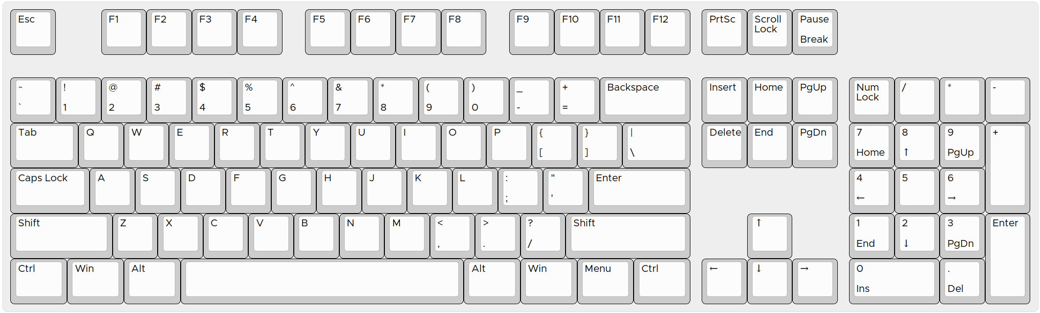
For the purposes of actually making the keyboard, I added back the numpad and navigation, giving us this final mockup. (click to enlarge)
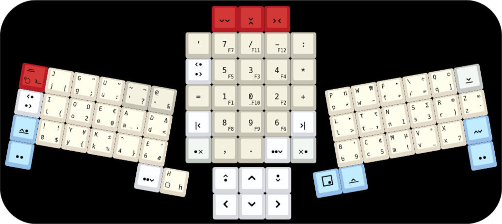
ErgoLinear X6.5
The modifier keys use symbols rather than words. The design is borrowed from and inspired by (for the new keys) Mito's Bauhaus Icons design. I don't know the copyright status on those ideas.
This is actually the 6.5 variant not the 6.4... only difference is the : and ; are swapped around. I ordered the keycaps while I was still testing, and it looked like 6.5 would beat 6.4. Turns out it didn't.
The numpad layout is also unconventional, based on most frequently used digits. It also has other commonly-needed punctuation and Tab keys in the cluster. In truth I still want to optimize the numpad layout, so the final version might differ.
If, like me, you're doing something non-standard, you'll need a way of printing the keycaps, which we'll get to in the next section. But part of the design is picking the font to be used.
The starting point is usually Signature Plastic's famous Gorton Modified, which looks like this:

Gorton Modified
Gorton Modified (Carbon colour scheme)
However SP insists that it does not exist in an electronic form, so we look for alternatives... In general, we want a sans serif font, because keys are not generally flat and/or smooth, and the printing processes have limitations, which means they can't do the fine serifs so well.
The key (pardon the pun) points (ditto) of Gorton Modified are:
For KLE, Ian Prest actually bought Engravers Gothic font, which is similar to Gorton Modified but not identical.
It has small caps rather than lower case, and looks like this:
Engravers Gothic
The Reddit/MechanicalKeyboards wiki has a list of fonts used on commercial keyboards.
For this keyboard, it was actually more difficult than expected to find a replacement font, mainly because I have marked the keys with the lower case letters as well as capitals. I found lots of fonts, but the similarity between I (upper-i) and l (lower-L) was too much. In general, I was looking for:
So I stared at a lot of fonts. Went through the entire sans serif selection on Google Fonts, as well as whatever I had on my system, as well as programming fonts and other places with free and not free fonts to download.
One suggested replacement is the commercial font Gotham Rounded medium, which looks like this: (click image for larger view)
Gotham Rounded medium
There is a font which goes by the name Armani, which is available to install on Android phones via the iFont package. However I was unable to track it down online, either by name or characteristics search or even image search. So I don't know what it actually is... the metadata in the file have names from well-known foundries but I can't find it on their sites. It looks like this, which is very close to Gorton apart from the upper-i which has a top and bottom: (click image for larger view)
"Armani" (?)
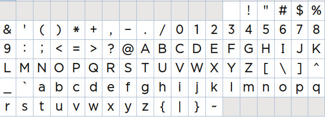
Which brings us to the free options. One possibility is Source Sans Pro (available for example from Google Fonts), and which looks like this:
Source Sans Pro
It does differentiate between upper-i and lower-L, but the tilde is a little flat, and it lacks some of the punctuation and Greek glyhs, which means I ended up with Hack.
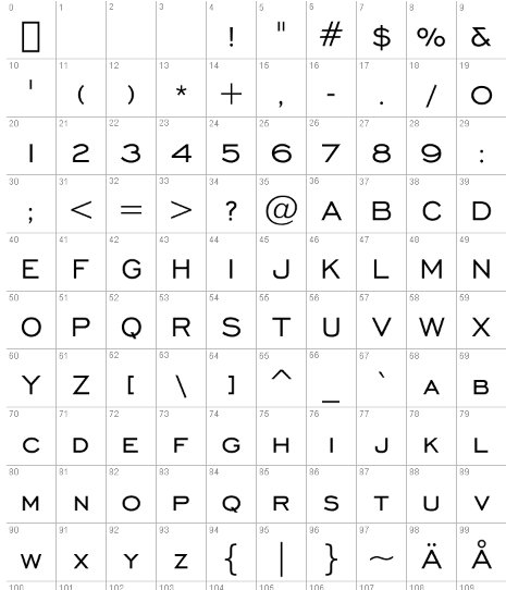
Hack is an open source typeface designed for programmers. It looks like this:
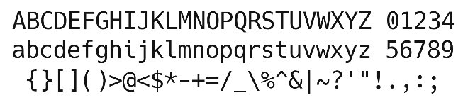
Hack font
All the possibly-confusing characters are clearly distinguished. The ,.;: are good sizes. Apart from those characters, Hack has good coverage of the other glyphs I need. Yes the zero is controversial, and the typographic quotes could be prettier, but all things considered, I think it looks okay. It's not Gorton Modified but it will do.
Other options to consider, if you only need conventional characters:
I put together a comparative view of the most similar fonts to Gorton Modified that I could find, and scored them by subtracting the "not very similar" glyphs. The glyphs highlighted are because:
So the top fonts after that exercise are
For your viewing pleasure, here are ANSI104 mockups. Click image for widescreen view.


But wait! There's more....
If you want something like Gorton Modified, but perhaps a bit more modern and/or stylish, take a look at Quicksand (free) or Atami (free)

Or how about something more modern with a techy feel? Use Prime (free)
Next: Components and tools.
 |
Xax International Copyright © 2024. All rights reserved. |